Customer habit of shopping is undergoing major reforms. People prefer to buy online and when it is online people prefer to dig into their mobile app as a first choice. A well-designed mobile app UX will engage customers and create a lasting impression in their minds.
The domination of mobile apps is forcing businesses to adopt engaging mobile apps. Empathetic mobile app UX can allure new users while retaining old users.
Features of A Good Mobile App UX
- Thumb-friendly screen zones
- Uses Microinteractions
- Provides Auto-suggestions
- Contains descriptive, well-labeled forms
- Easy to search from anywhere
- Simple registration and checkout
- Consistent environment
Thumb Friendly Screen Zones

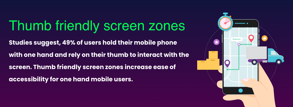
Placing elements comfortably encourages users to take action. Studies suggest, 49% of users hold their mobile phone with one hand and rely on their thumb to interact with the screen.
Based on their ease of reach the mobile phone screen can be divided into three thumb zones: easy-to-reach, hard-to-reach, and in-between areas.
Designing around thumb zones to put important elements in the “easy-to-reach” zones improves usability.
Uses Microinteractions
Liking a product, picking a color or size, and zooming an image are examples of microinteractions.
Microinteractions are small design details created to achieve a single task and delight the user.
They can guide the user through a product in a fluid and intuitive way to improve the natural product flow.
Provides Auto-suggestions
Auto-suggestion predicts search queries and speeds up product viewing. It also helps to fill up forms quickly and prevents the user from getting tired of filling up various fields.
Auto-suggestion can be in the form of address lookup, saved cards suggestion, or saved address suggestion. Providing inline input validation can also help the user to check errors then and there and improve usability.
Automation of various data entry processes through auto-suggestion improves usability and in turn, increases the conversion rate.
Contains Descriptive, Well-labeled Forms
Allowing users to fill up forms as fast as possible is one of the key objectives of mobile app UX design planning. Well-labeled forms clear users’ curiosity about the intent of the form or its fields and reduces anxiety.
Placing form labels above the form improves readability, ease of use, and clarity. Users don’t feel skeptical about why some data is being collected while filling out the forms
Strategically Placed Search

Search is an integral part of a buyer’s journey through an app. Mobile app UX should be designed with an easily visible search icon or bar.
UX should be designed keeping in mind when and where to strategically put the search. For example, a search icon in the later half of the buyer’s journey, on the checkout page, will only distract the user.
Providing predictive suggestions in the search depending on the user’s search history or integrating advanced filtering options will make the journey very intuitive.
People also enjoy the feature of speech-to-text voice search which takes away the stress of typing on a small screen.
Simple Registration And Checkout

The Baymard Institute reports a rate of 35% for cart abandonment because of the requirement to create an account before purchasing. The checkout process is the most stressful part of a buyer’s journey.
Avoid a lengthy checkout and ask for information only if you need it. Integrating autofill fields and allowing easy modification of orders will make the journey pleasing.
Consistent Environment
Build a consistent environment around your UI and create a mobile app UX without many hitches. Buttons, color schemes, and typefaces should look the same.
There should be consistency in designing microinteractions and animations on different screens.
Maintain a design palette throughout your mobile app, website, and products.
Mobile App UX Will Continue To Play An Important Role
By 2025, the global online retail market is estimated to reach up to $7.385 trillion, indicating e-commerce mobile apps will become the driving factor for retail business. Apart from the above tips, there are several other considerations to be taken before designing a mobile app UX.
Integration of AR in eCommerce, maintaining an omnichannel strategy while customers switch between mobile app and website, adding a save button or a wishlist so that customers can come back later to buy are some of the effective engagement strategies that will increase retention of eCommerce customers.

